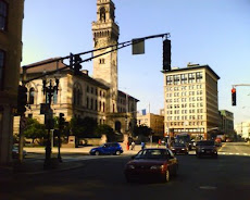
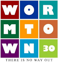
Well, what do you think ? A blatant rip-off of Destination Worcester and Wormtown.org.
It might make a cool t-shirt.
1 comment:
Anonymous
said...
Hi, I like the logo, very colourful. The only suggestion is, do you need the medic at the bottom. I think it's enough with the coloured boxes and the medic symbol. It's always good to be a little bit abstract!
I was a 911 paramedic at UmassMemorial's Worcester EMS for 22 years. I have been assigned to a regional SWAT team as a team medic. I am currently a flight paramedic for UMassMemorial Lifeflight. I teach Tactical EMS when I have the chance. I enjoy road cycling, running, and hunting on my days off.


1 comment:
Hi,
I like the logo, very colourful. The only suggestion is, do you need the medic at the bottom. I think it's enough with the coloured boxes and the medic symbol. It's always good to be a little bit abstract!
Post a Comment